
LISTOMANIA
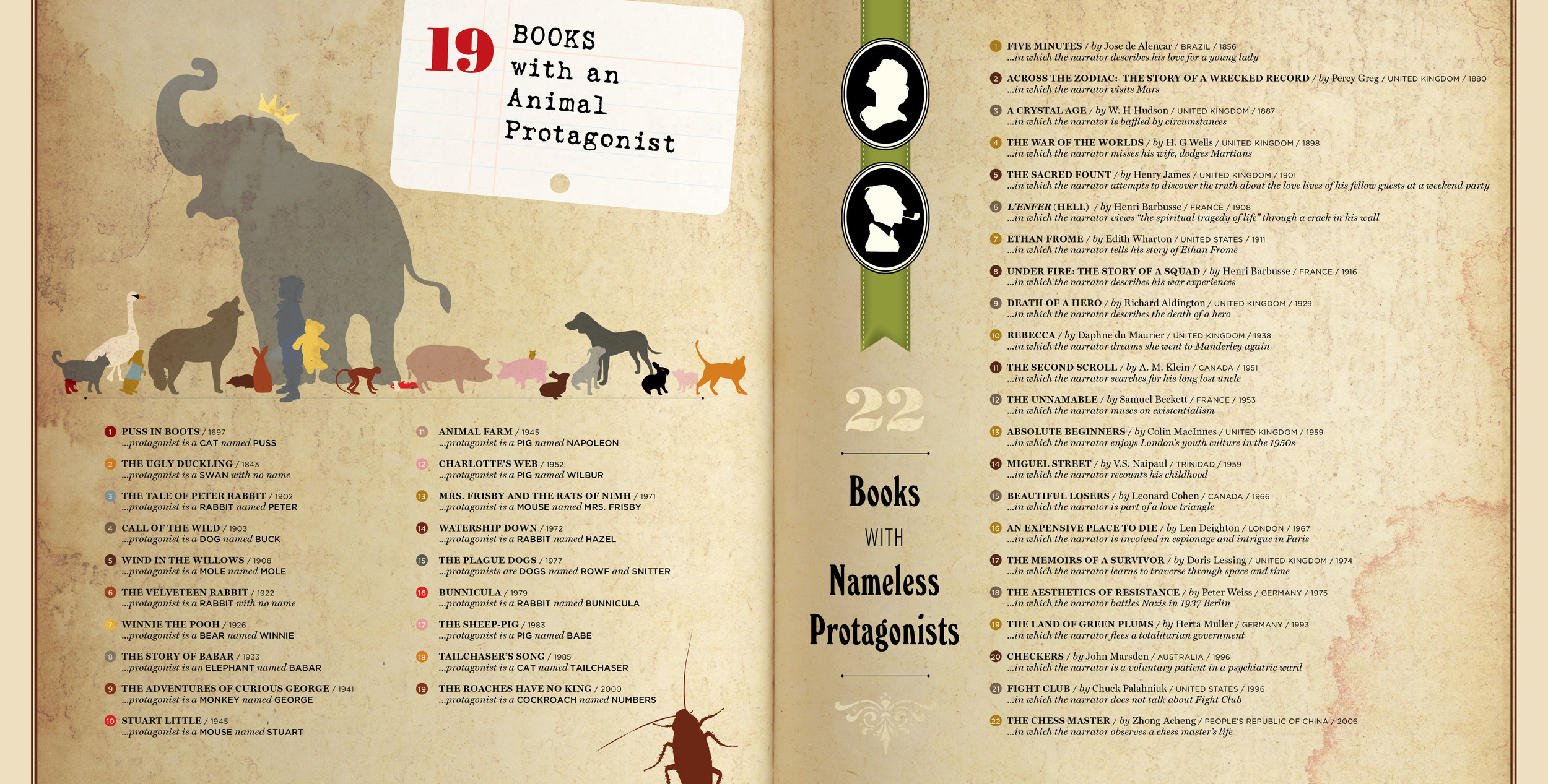
Because it was built by several far-flung designers working independently, the template for this book of lists called for an art style of simple silhouettes, an overall texture referred to by stock image sites as “grunge” (a term which for some reason drives me nuts), and a consistent treatment for all numerals and running text. These thumbnails are quite wee, so it will be hard for you, I think, to appreciate the mouse-sized sports car that I drew for Stuart Little, or the adorable fangs and glowing red eyes on Bunnicula.
-------
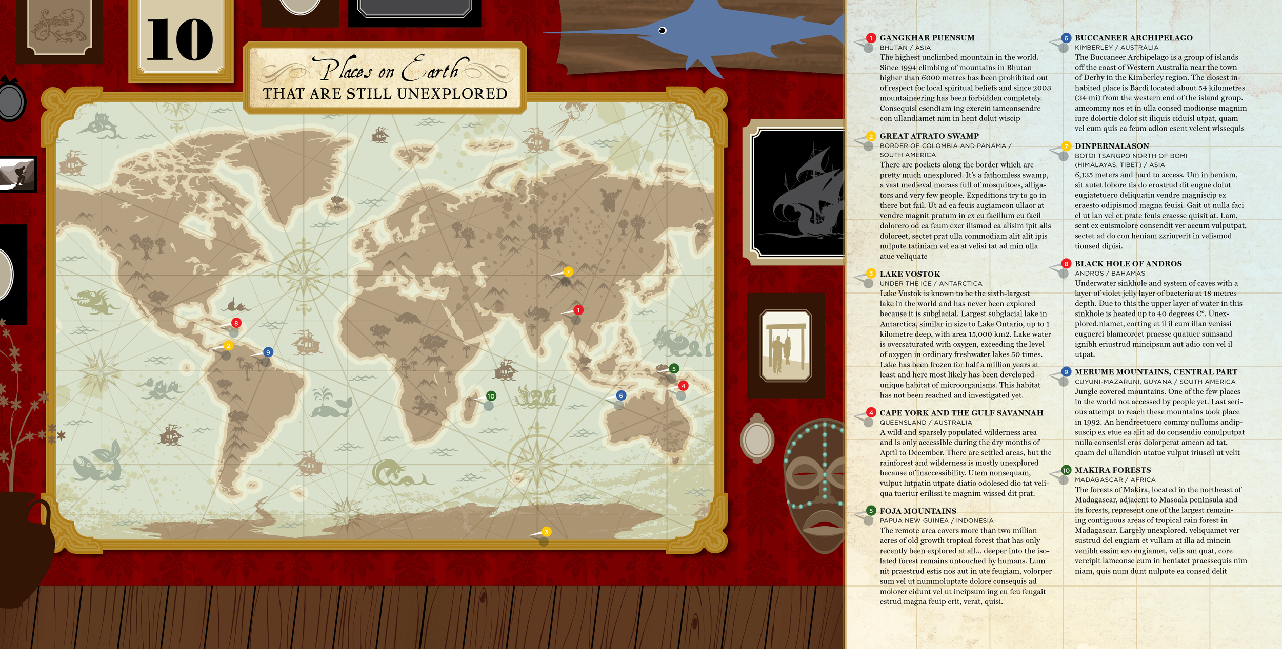
The design language for this book uses flat, saturated color, but my art director agreed that a gradient felt more appropriate and map-like under my List of Unexplored Places. Everyone laughed in 2003 when I said I was bringing back the gradient fill but who’s laughing now, suckers? Oh, still you. Dammit.